

© Daniel Buren, ADAGP, Paris
The colors of the work
MS: How did you choose the colours and arrange them in the work?
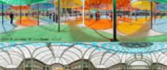
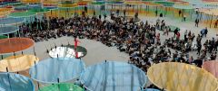
DB: First of all, and this often happens to me, the decisions and choices made depended not only on the constraints of the venue but also on the materials available. For colouring the light as I wanted to, the best solution turned out to be plastic film, a light, flexible, transparent material, stretched over circular steel frames specially made for the occasion. But this film comes only in four basic colours: blue, yellow, orange and green. So I used those four colours because there was no other choice. So that was my basic coloured material, to which I added white and black.
Then, using a very simple system which proved to be very effective, I distributed those four colours over the plan of the whole device, starting from the top left (the north is on the right) and systematically filling in all the circles with colours in the alphabetical order of the names of the colours (in French): blue, yellow, orange, green. That gave an astonishing distribution in which the first colour (blue) was used 95 times and the three others 94 times. An equal distribution, plus the first colour, as if the cycle B, Y, O, G, B, Y, O, G, B, Y, O, G could go on forever but had to end with the first colour, blue.
In the centre, the vertical projection of the circumference of the dome stops the accumulation of coloured circles and opens a big circular empty space on the ground. This ring is filled with round mirrors reflecting the image of the dome, which visitors can climb on to. The dome is coloured with a chequerboard pattern of filters, placed at the highest point in the space, on the skylight itself, more than 35 metres in the air. The colour used here is blue, and I am looking forward to seeing how it will mix and the new colours that will appear when it is projected on the four colours of the circles underneath and on the black and white stripes on their vertical posts.
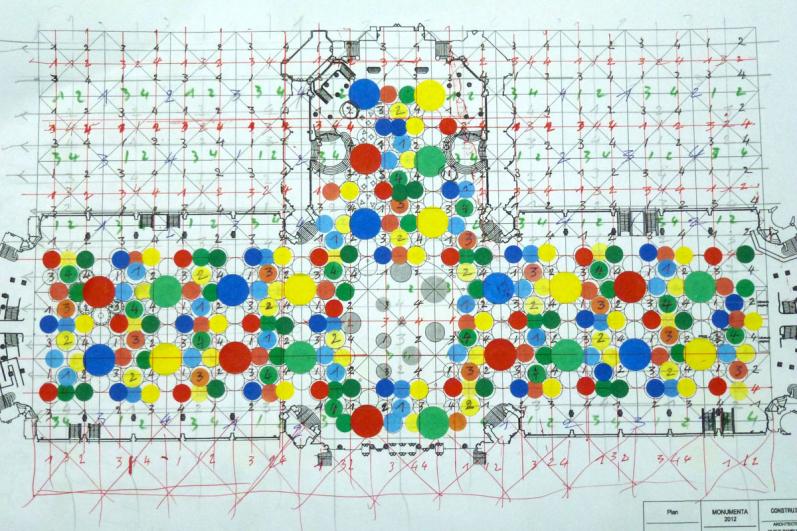 Daniel Buren, Photo-souvenir : Esquisse graphique pour Excentrique(s), travail in situ
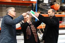
 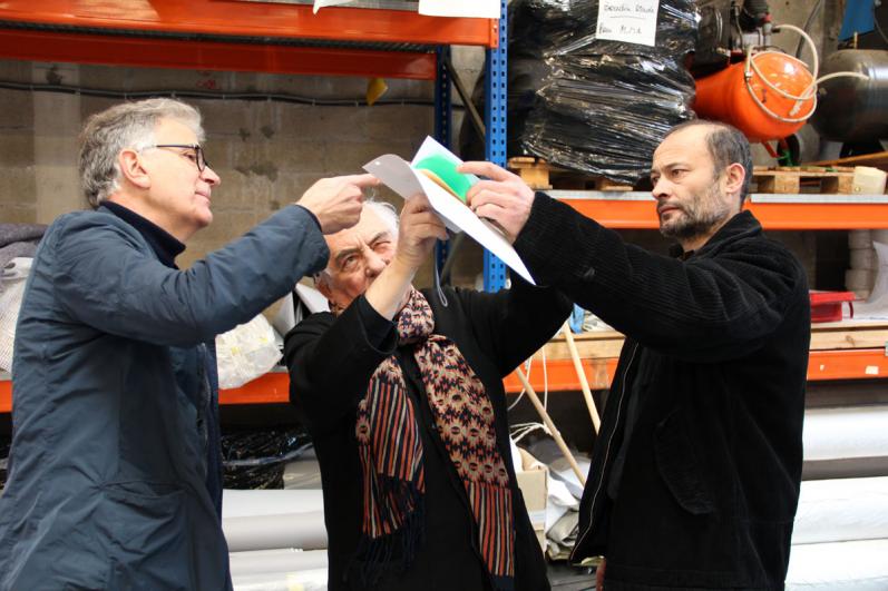 Photo-souvenir : tests de couleurs, Patrick Bouchain, Daniel Buren, Patrick Ferragne, février 2012